Some initial thoughts
I have never thought about my relationship with the natural world till now but my relationship with the natural world is quite inclusive as I contribute to what is happening in the natural world but I also have a strong relation to the sea as I used to sail. I personally would go to the countryside to take landscape photographs but I could also go to parks as going to the countryside would take a while but going to a park or a nature reserve is quite easy. People enjoy photos of nature as nature is always has something new or undiscovered. Photographs can change how we see things if we look from different perspectives so people can see what is happening for example if there was an event it would make somewhere bland seem more fun or if they use something to change the colours of the scenery
What Is A Landscape Picture
From my mind's eye something I can see when I hear landscape is hills, mountains or forests. A list of 15 words that come to mind when I think of landscape are: Nature, Sunsets, Cities, Busy towns, Sunrises, Unnatural light, Mountains, Forests, Hills, Lakes, Clouds and Vehicles. When I search for landscapes on Google I see many photos that focus on one tree in the foreground whilst there is a forest which have a colourful skylines. My ideal landscape would be near some water whilst including a forest or a mountain. A landscape that I can see when I look outside is a set of trees and a clear field behind it. I have taken a landscape photo before which was at a castle near the white cliffs of Dover which included some flowers in the foreground whilst having the docks of Dover behind it. I enjoyed it quite a lot and I took it because I wanted to experiment at the time because the photos I were taking at the time started to bore me.
Examples of landscapes - from google search


My attempt on making a landscape.


I believe that these images are considered landscapes as they are taken in a landscape format and are not of buildings and town but only nature
WWW:
|
EBI:
|
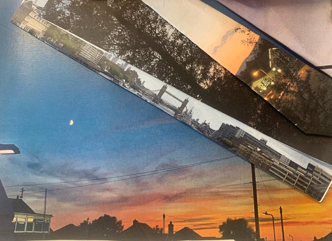
Dafna Talmor


Dafna Talmor is a visual photographer who uses multiple landscapes and reconstructs one image using pieces from the other images. and then makes amazing photographs. Dafna Talmor's landscapes embrace the use of photography as well as making it multi-dimensional. It is an unnatural photo taken in a landscape format. It looks quite clean except of where the photos are not joined together and there is an orange light breaking through the gaps and that is what makes these images quite distinguished compared to the usual style. The images make me feel that although it seems relaxed there is fear from below my view.
Response to Dafna Talmor


My work was influenced by Dafna Talmor as they said something that I found really interesting, "there is no perfect photo" and that made a impact on my work as it made me confident to try more risky images especially with the use of the slides that we customized. The risks I took I believe that they worked as the images when projected amazed me. Something I took away from Dafna Talmar's work was that
Some more landscapes


WWWWhat I believe went well is that I was able to get long distance landscapes as well as getting some of the images of the sun making an effect either on the water or the tree line
|
EBIWhat I believe went poor in my opinion is that I was unable to get the film developed digitally. Another thing I think I could improve is that the pictures in London are not up to the standard I would want
|
Double landscape
In this part of the project we used a previous piece of work and cut something out of it and I decided to cut out a tree which is quite simple but it was quite useful as it did not affect any of the sides of the image so I would not have to stick it in place

The original landscape
After that we went outside and used it to take photographs of another landscape in the background


My favorite image

|
WWW
something that I believe went we was that the image constantly had both the sky and an image in the background which meant that there was some sort of nature as well as some sort of urban landscape which meant that the image resulted in the image being amazing in my opinion. |
EBI
Something that I definitely think I could of done better would be that I could of chose a better time to go outside as when i went outside it was incredibly windy which made it hard to take photos as the image would be moving around creating obstructions in the image which ended with my hand being included in the image. Another way to improve would be to include the sun behind the structures. |
V&A school trip


Favorite Photographer - Rinko Kawauchi


I found Kawauchi's work fascinating as it made something so simple quite interesting and it made me think in a different way compared to how it was before as the work was of something simple but was showing it through a new light which results in peculiar photos such as those above.
Dionne Lee's Constructed Landscapes
The video was quite creative as they used a set amount of materials which were photographs of pre-existing landscapes that they got access of from magazines and then they either tore an image in a certain direction or they would cut a line down so they would be able to fold it so it would display the other side which would show part of a new image which would result with another landscape being created. the only tools that were used were her hands and a pair of scissors. I believe that it is different compared to the "traditional" style of landscape as her decisions resulted in completely new images and whether she cut the image with the scissors or tore as if she tore the image it would reveal the blank paper it has printed on or if she used the scissors it would be a clean cut and not be affected by things out of the artists control but the way they flipped the pieces of paper revealed a new piece every time.
My response to Dionne Lee's Work
This is mine and Arthur's response to the work of Dionne Lee's work, we used a time lapse to make it easier to figure things out although that wasn’t always easy


Hiroshi Sugimoto


Sugimoto used an old large based format camera with his focal rate to twice-infinity which I find quite interesting as first of all he decided to use an old format camera although he was able to choose newer cameras with a higher quality and another thing is his choice to set the focal rate so high. The work is sort of eerie as having the images in black and white remove all of the colours. The reduction in colour make the images unsettling in my opinion as the work is quite secretive as nothing else i s settling

|
Favourite imageThis is my favourite image as it has been blurred to a factor that its visible to a certain factor so when I look at it the image I can tell what the image is whilst I understand what the image is about whilst it also has some sort of mystery to it as although I can see the Eiffel tower I can not see the sky behind it or if it has any nature connected to it
|
Boke


WWW
|
EBI
|
New response
For the image above I used the four images below and used the telephone lines from one of them to sector it all off so the work would be easier to sector as well as making the work more spaced out in some sectors whilst being quite cramped in the top right quarter. I was quite happy when I folded the images that went between the telephone wires.


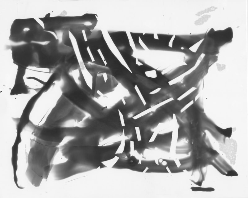
RAY K. METZKER


This is an image from Ray.K.Metzer's project called "picterus interruptus" which is based on doing a simple image but then put something in front of it so there will be some sort of blur so that the foreground is quite mysterious and causes havoc to the background by making something unseen which causes the viewer to be intrigued about what is going on the background and is there some sort of mystery connected to it. The images are always something that are interrupted hence the name picterus interuptus

|
This is my favourite image as the work is quite abstract compared to the others so it intrigues me as the work seems like a sort of modern buildings. The piece of card works as some sort concrete building causing so of the light to be blocked off from the camera and the use of an object of some sort at the bottom of it makes it look like a herd of people heading towards the distant building.
|
My response to Ray K. Metzker
Above is the 10 images I took outside of the usual area I restricted myself as I believe that the results will better as well as that the images will be unlike those with the people I usually work with
Then I tried it in another method by using a cocktail stick and some circles I had made from previous photos. i then made a vast amount of photos to accommodate the amount of work that I put into creating the interrupting pieces.
|
WWW:
|
EBI:
|


Homework due 17/10/22


I believe that this work is something I can enjoy as it means that I am able to merge my work with other parts, many which are visible from the past and to re-use them in new pieces is quite valuble
Responce to Brea Sounders


I used google maps to find errors made by the google maps ai which is used to remove the photographer from the image so I found the errors on the site and then photoshopped colours onto the screenshots and made it appear differently compared to before
Trying to remake the image with spare material


Minimalist Landscapes: What Remains


I like both of the prompts as there is a obvious difference between the two pieces as well as that the way that they have used both a negative as well as a positive in a sort of collage whilst the other is just pieces of black card placed upon white paper to cause some sort of out line. What I believe is missing from the liz Nielsen piece it does not have a distinctive item that’s drawing the viewer in to the image whilst the Barros piece only has one image in the foreground whilst the background is very plain and boring. Something that I find interesting about the Barros piece is that although the background of the piece is empty it still kind of draws the viewer to the image. Something that I believe is interesting about the Nielsen piece is that although the work is minimalistic it still gives you a good idea to what is actually in the image. For the Barros piece I feel sort of empty as although there is an image within the foreground the background is quite plain which drives me to not really feel anything. The Nielsen image provides a completely different emotion, confusion, as the work is unusually descriptive for how little is actually within the image. To create these images I would create a negative to start it off and then after that i would move on to creating a positive from the original negative, the negative would be made out of black card and white paper. I believe that the amount removed from the images is to make the images minimalistic to begin with as well as making the images more mysterious. I prefer the Nielsen work as the work is more unusual compared to the Barros work mainly because the background actually is bland and appalling which makes me dislike it
My responce


This is my response to Nielsen's and Barros' work where I used light sensitive photographic paper and black pieces of card so when the negative is exposed to light there are pieces that are not turned from white to black but the other-way round due to the fact that black card stops the light sensitive paper being exposed to the light from the enlarger. The paper needs to be under the light for 10 seconds whilst being in the darkroom. After being exposed to the light I put the now exposed bit of paper into developer for one minute so it can react with the chemicals then once the minute ends I use tongs to grab the paper then I would shake the paper and try to shake the developer off the paper then I would submerge the paper into the stop for a few seconds so the chemicals stop reacting. After that I would yet again shake the chemicals off and then I would submerge it into the fix for five minutes so the image is fixed to the paper. To finish it off we would place the paper into the wash for as long as possible to make sure that the work is done. I would also use a squeegee to make show that no water spots will appear on the paper as it would ruin the image.
|
After that I went to try something new but started off with the original negative so thats already been said but from when the paper has been under the light from the enlarger for 10 seconds whilst being in the darkroom it changes as instead of submerging the paper I would use a paint brush and use the developer to paint certain patterns onto the paper. Afterwards the process stays the same just incase some developer went to other places. Overall I believe that the original positive is better as the work has lower chance of having any issues or mistakes compared to the second piece of work as I was quite nervous which lead to errors on it as well as having an easier process compared to the other. If I had something different for both of the pieces would be to be more precise with the placement of the card as I believe it mad a difference to the final piece and comparing it to the original piece it is quite different. The first image is more like a night sky due to the fact the that the only thing visible is a cloud and a tree. The second piece of work is something I believe is that the piece is like a tree in a tropical storm of some sort.
|
|
Research
3 artists
|
Maja Strgar Kurečič
Captures in their words "the edge of the universe" which makes sense as how abstract the work is especially how the work looks like it is from space with the texture of the work being unusual. What intrigues me to this work is how the artist has used items which I wish I knew how it made |
|


|
Helan Sear
Helan Sear's work intrigues me due to the fact that there is a bunch of lines randomly placed in the image which creates the illusion that there are more trees or something along those lines. The main thing that intrigues me to this work is that the work is quite abstract compared to the others and have the theme that the work does. |
|


|
Fabian Barrau
Fabian Barrau is an artist who uses photoshop and makes images of our current landmarks and what they will look like in a couple of hundred years. Each of the pieces are very different to the other as one is is a barren desert whilst the other two are more about places being overgrown which are polar opposites to the other. |
|


|
Attempt number 1
This was the first attempt and it was very difficult but I infused ideas from the artists starting with choosing something recognisable which was inspired by Fabian Barrau and then the idea to outline the trees was inspired by Helan Sear as the highlight trees normally with bright colours which i decided to do the opposite by highlighting everythging else in dark colours ( I decided royal purple and a dark shade of crimson red) and then after I erased a layer over the capsules so it becomes a different shade. Finally I decide to use such special colours due to it correlating to Maja Strgar Kurečič's work which sparked an intrest to me. |
|


The progress above was used for every single layer of colour so it will result in the trees being outlined by erasing the colour of the pieces
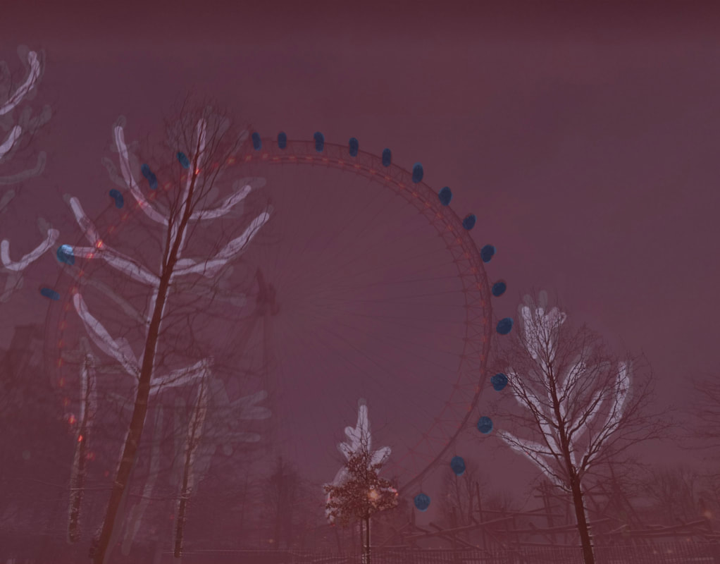
but on the red layer I decided to focus on the shuttles which are attached to the London eye so it.
but on the red layer I decided to focus on the shuttles which are attached to the London eye so it.
Attempt number 2
|
I decided to have another attempt due to the difficulties that I had with the previous one, so I decided to use a randomiser of images that I had taken in recent times. I then decided to try to find something else that I can highlight the colour of and then the colour of the leaves came to mind so I decided to change the colour of the leaves to something abnormal and then kept trialling with the colours until I decided to use a random colour generator and it chose the colour blue lilac for me. But before that I decided to use the sky replacement tool and made a new sky for the piece as it was quite plain on it. Afterwards I decided to erase part of the first layer and then afterwards I went and placed two rectangles of two random colours decided by a random generator those being pure orange and grey green, this resulted in the image being split into four corners. After looking at the work up to that point I decided to go and add another colour so yet again I used the random colour generator and got pastel yellow and decided to highlight the top left corner due to thats where the colour had the most impact. I decided to leave the work after that I believed that I could not add more to it but there was something missing in my opinion and I could not decide what
|

|


The finale of the second attempt
|
The finale of this piece does not feel finished to me due to the factor of the piecing of this and I believe that the work would be better if I include more than the simple steps that I took to create this piece and this is due to the actual placement of this work especially how the work could be put into a higher depth mainly due to how the work has distinctive features but I know that if I put more layers into this work such as features or if I merge the piece with another of a few others and combine them to make a sort of collection that is different to my former work which is more of a one time piece.
|
Final outcome
For the final project I decided to make five separate pieces which related to the landscapes i see within my daily life and each of these pieces has been edited so that the images can be viewed in different ways depending on the viewer. The work has gone through many stages of work so that the work is has become more personal to me depending the amount of time it has taken to create that piece.
The pink tree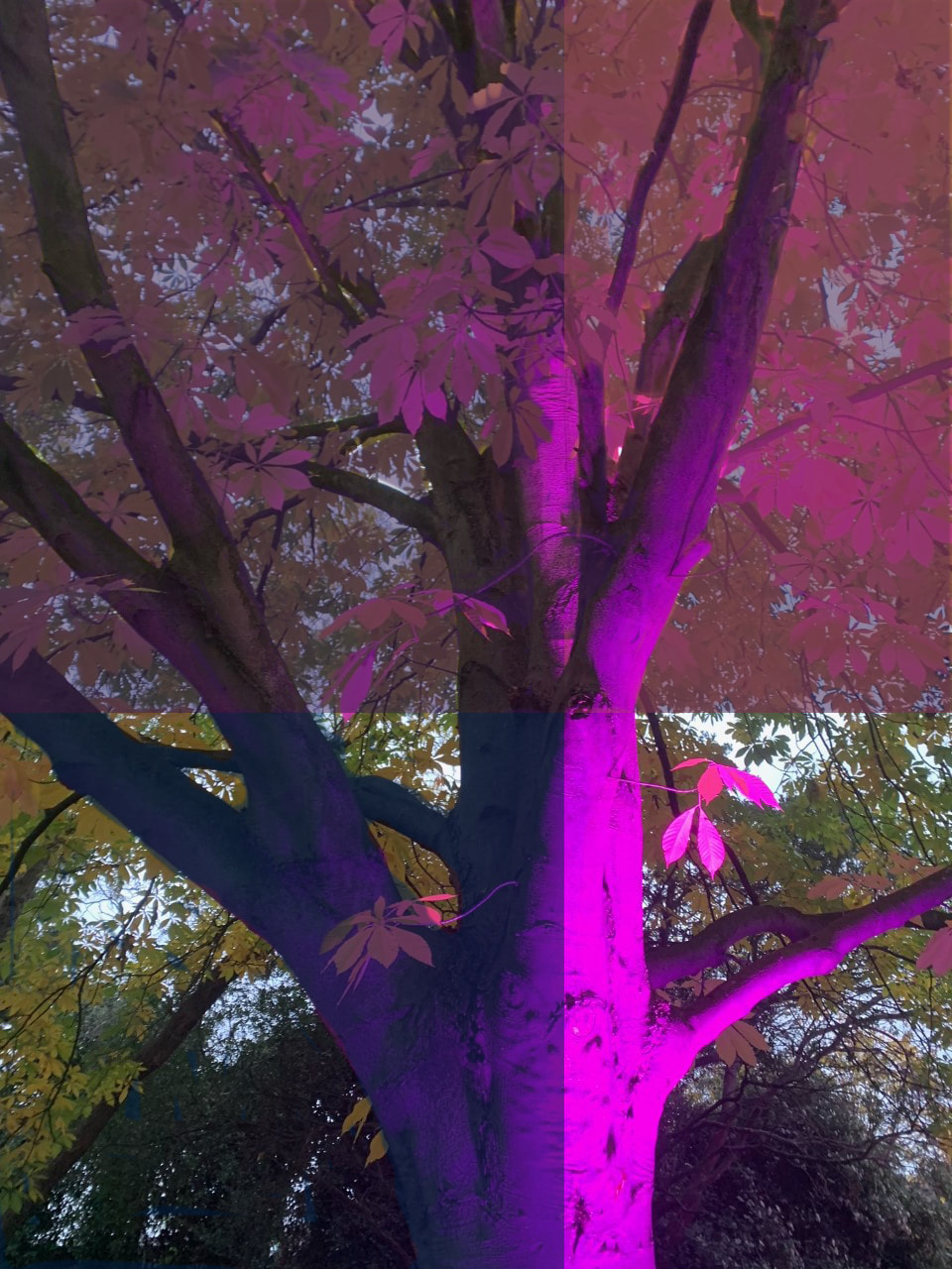
|
This piece was the first of the five to be created so the amount if time I spent on it was too much for the amount of work done on it due to me testing the features out and seeing what I was able to mess with and resulting in a piece that has the spectacle of such a small amount of work submitted into this resulting in a piece which only appears minimalistic on the amount of changes but the more you focus on it the more that can be seen to the naked eye. The steps of this was not much as it was mainly focusing on highlighting certain features so such as the bark of the tree on the bottom left of the screen where the colour of the piece changes
|


|
This was the second piece of work which in there is divisions within the work to give glimpses to what happens to the work. The work also has many lines certainly in the yellow section where I decided to to outline the tree but ignore the so the only part from the original is the trees in that section The work is to highlight how the bark of the tree remains whilst the surrounding landscape constantly changes
|
Through the seasons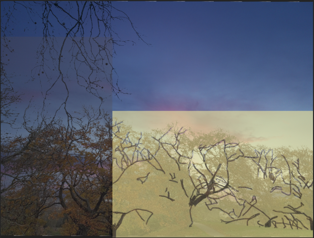
|


Haunting nights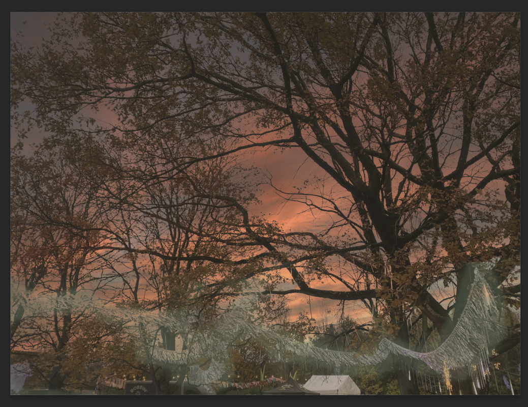
|
This piece of work is quite simple to its counterparts but since there is not a blatant difference unless you put the original right next to it and then you notice how the work has drastically changed compared to the original piece. the work has so far gone and became a completely difference piece with a small amounts of edits to the piece. The piece in my opinion relates to how throughout time the essence of something shiny in always appeared as something positive and then the dusk is related to fear due to in
|


|
This photograph took the longest to make, due to the depth of the image. The image relates to the complexity of the gal, the many layers relate to me about how the many layers of the galaxy, due to how the layers of the image are all based around a certain point which led to the work being at certain angles. The leaves make the affect of some sort of space which made me think of the whole galaxy on the tree which amazed me and sparked a lot of interest in the themes of space .
|
Galaxy tree
|


Disco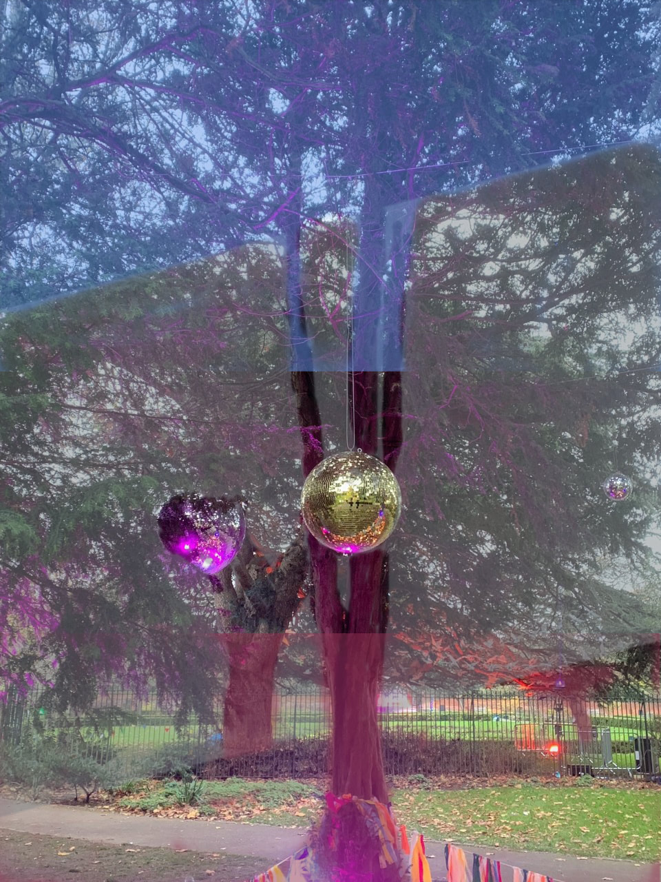
|
This image was an odd landscape that only happened by chance due to how there was an event going on at my local park. This image is more about the spectacle of duality due to how the categories of blue and red in this image co-exist just like how the two different types of disco balls which are unnatural contrast the natural background.
|


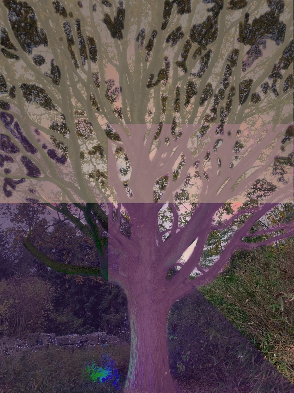
Favourite image
|
This image is my favourite due to the amount of time that went into this piece and how the piece went from a simple tree and through nine steps which took a while to create due to the depth that went into the work. Another reason why I favour this image is due to how the image is positioned on the screen especially as the trunk of the tree is positioned at the centre of the bottom third of the photo which shows the actual size of the tree as well as how the tree although placed at one spot consumes a larger space the older it gets which also relates to humanity so that intrigues me as the older the species of humanity get the more people consume the space across the earth.
|
Final Evaluation
The theme that I explored within this project was constructing landscapes and when we begun exploring this theme I was curious with what the actual explanation of this project and the more that I explored this theme the more that I understood that there is no true explanation for this project as it all depends on the viewer and their perspective of what they believe the theme is about and that constantly inspires me as the work that occurs is all based upon my perspective but reviewing others opinion on the work fascinates me. Within this project I have researched but artists that I took a lot of inspiration from Helan Sear due to the use of vibrant colour used but using lines to create those features which lead to me using bright colours in my final piece so that the work could thrive in my opinion after being exposed to colours that do not belong to these settings.
To create the final project and involve such concepts I had to experiment using features in real life such as putting things in front of the image (picture interruptus) so the image has a new foreground to what was originally happening. To create the final project I began by taking simple photos of landscapes which I see in my day to day life as I believed that I could augmentate the work similar to how Helan Sear had created her work. Compared to what I was originally hoping to create which was just making the trees within the landscape a different colour, I have changed much more than I planned and that is something that I am pleased with as I have been Inquisitive with the work and have been curious with what I could do to constantly improve the work compared to what originally looked like as if I put the work side to side it would take a moment but you would originally realise that the base of these images are not similar to what they look like now. The theme of the unnatural came to me for this work due to what is happening to our wildlife as more and more forests are being cut down as well as having more and more fields being made into mazes with the walls made by towers of flats. I believe that the work that I have made has surpassed the original expectations that I had for this work and it has helped me successfully explore the theme of unnatural as well as constructing landscapes. If I had more time with my work I world try and use more of my inspiration from Helan Sear for the work
I have used my website to record the main pieces of my work especially the pieces that I feel are key to what I have been learning and example of this would be documenting the attempts of Hiroshi Sugimoto's work as the work inspired me at the time especially how the work was of certain landscapes and then I have documented the thinking as it will help me revisit the steps it took for me to create those pieces of work
